MyFitnessPal
While working at OrangeYouGlad
A utility driven app in need of personality
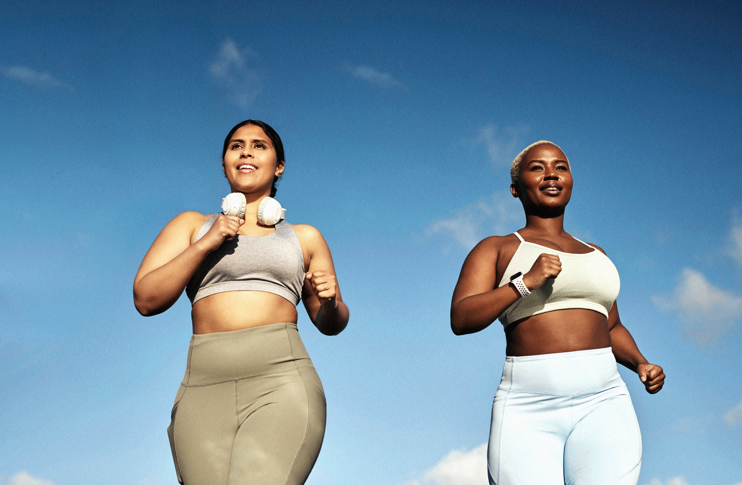
MyFitnessPal, an industry leader in weight loss and fitness apps, wanted help with a major update across the platform: moving it from a static and info-dense utility, to a proactive, easy-to-use, and daily nutrition-focused tool. Me and my design team partnered with their researchers to better understand flaws in the user journey. This resulted in the creation of a new user experience complete with additional user features, an added fasting feature, and a new UI design system.
Branding-wise, the challenge was to take what was once perceived as a utilitarian brand and make it feel warm, approachable, and just a little easier to interact with. The result of this was a new color-saturated brand that brings together friendly rounded cards, bold and bright colors, and clean shapes and iconography that was expressed across the app’s UI and in the marketing.
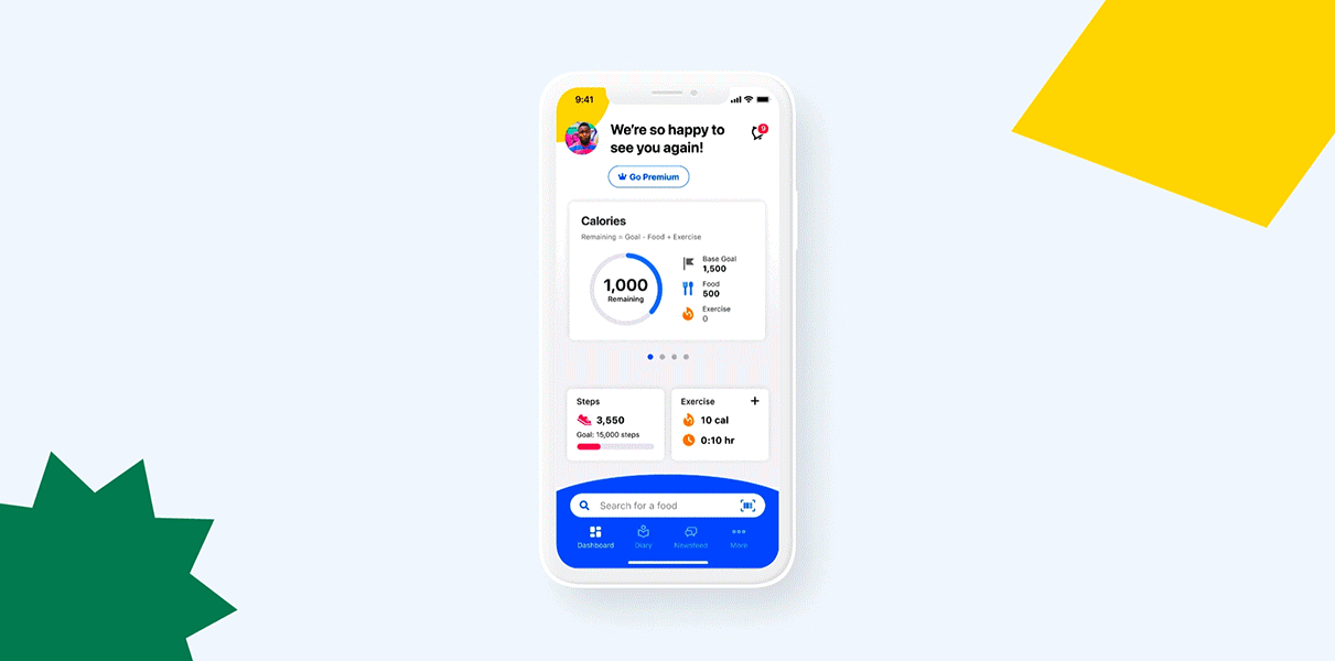


UI design library overhaul
MyFitnessPal came with an extensive design library already but was very very dry. Working with their design team, we made buttons a little bigger, replaced their excel-like rows and columns with cards with friendly rounded corners, and strengthened their type hierarchy. We also added a comprehensive icon system, charts, a versatile and vibrant color palate, and a variety pack of illustrations.


